By Devansh Desai
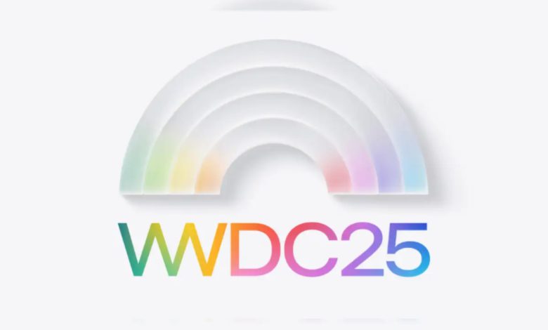
Apple’s Worldwide Developers Conference (WWDC) 2025 is shaping up to be more than just a developer event it’s a loud, calculated statement. After years of subtle UI tweaks and incremental updates, Apple is finally embracing a sweeping change that not only redefines the look of its operating systems but also reflects a shift in branding philosophy.
A New Look — Or a Familiar One?
Apple’s rumored new design language, internally codenamed Solarium, aims to unify the visual experience across iPhone, iPad, Mac, and even Vision Pro. Floating elements, softer edges, translucent panels sound familiar? VisionOS already introduced this aesthetic in 2023, and Apple seems ready to expand it system-wide.
It’s bold, yes. But it also feels like a response not just a vision. With competitors like Google pushing Material You and Samsung refining One UI, Apple’s redesign seems less like a pioneering leap and more like a long-overdue catch-up.
The Great Rebrand: iOS 26, Not 19
Perhaps the most surprising shift isn’t visual it’s semantic. Apple is reportedly scrapping the sequential naming system in favor of year-based labels. That means goodbye iOS 19, hello iOS 26 a move that aligns with the 2026 release year.
This rebrand isn’t just cosmetic. It speaks to a new marketing strategy: simplifying product cycles for mainstream users. When someone hears “iOS 26,” they instantly know it’s current. Smart? Yes. Risky? Also yes. It could dilute the sense of innovation that each new version number historically carried.
More than Just Pretty Icons: Real Features That Matter
Despite the cosmetic overhaul, Apple isn’t ignoring functionality. iOS 26 is rumored to come packed with AI-powered upgrades under the Apple Intelligence initiative. These include:
- Auto-translating messages in real-time, which could redefine global communication for Apple users.
- Markdown export in Notes, finally bridging the gap for power users who demand interoperability.
- A new Apple Music Lock Screen UI, aimed at giving Spotify some sleepless nights.
- Visual upgrades to CarPlay, bringing consistency from your phone screen to your dashboard.
Apple seems to be moving from just controlling aesthetics to owning the flow of interaction itself from home screen to car screen.
macOS “Tahoe”: What’s In a Name?
Naming macOS versions after California landmarks has become tradition, and “Tahoe” is reportedly the next stop. But the real story is how macOS might feel more like iPadOS and visionOS than ever before. For some, that’s a win. For others, especially long-time Mac users, it might blur the line between pro and consumer.
Final Take: Is Apple Leading Again?
Apple’s WWDC 2025 won’t just be judged by how beautiful its icons are, but by whether its redesign feels necessary or nostalgic. The introduction of consistent branding and design is smart, but in the age of AI and ecosystem convergence, users want more than aesthetic harmony they want intelligent coherence.
The good news? Apple seems to be listening. The better news? We’ll find out soon enough if it’s more than just surface-deep.


